What's on your mind?

Categories:
Art Direction
Illustration
UX/UI
Project Team:
Kristiana Vellucci
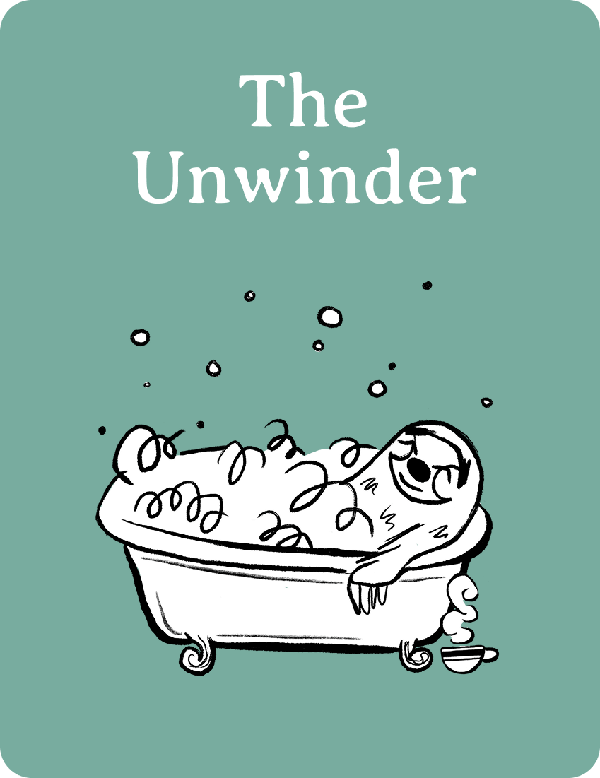
Art Direction, Design, Illustration: Unwinders, Connectors, Unwinders, General Illustrations & Decorations
Kate Sinclair
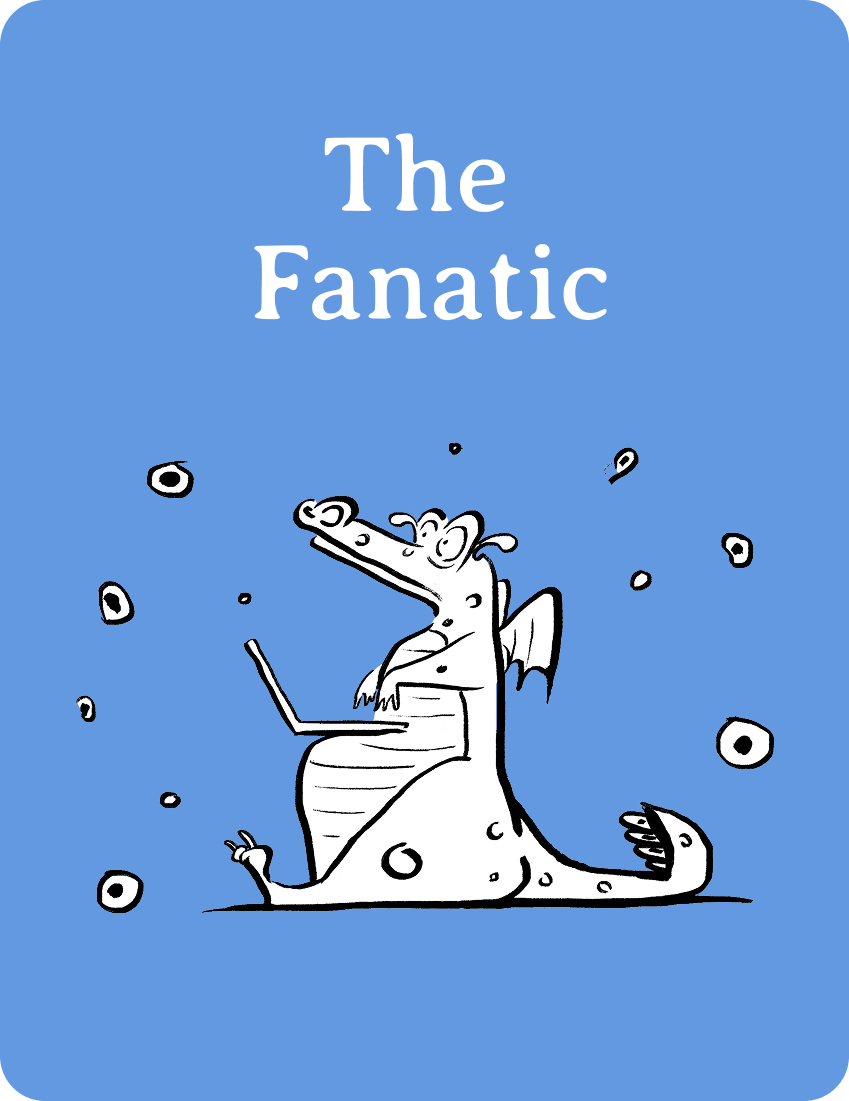
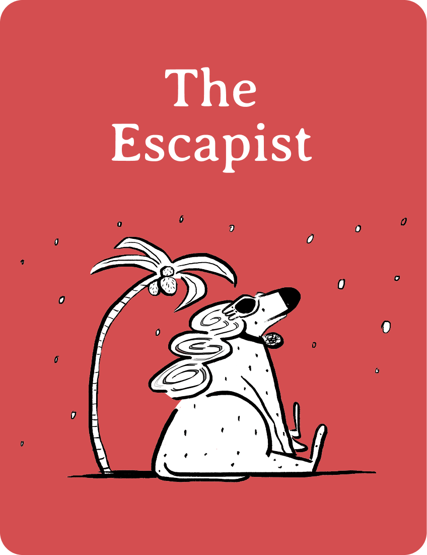
Illustration: Escapists, Connoiseurs, Fanatics
Stefanie Fiore
Project Management
Adrienne Marshall
Account Management
Penguin Random House is a leading book publisher. At the start of this project, they had interviewed over 2,000 readers to get a better understanding of their target demographic. Readers from the survey were divided into 6 user personas and key statistics were mapped to each personality type.
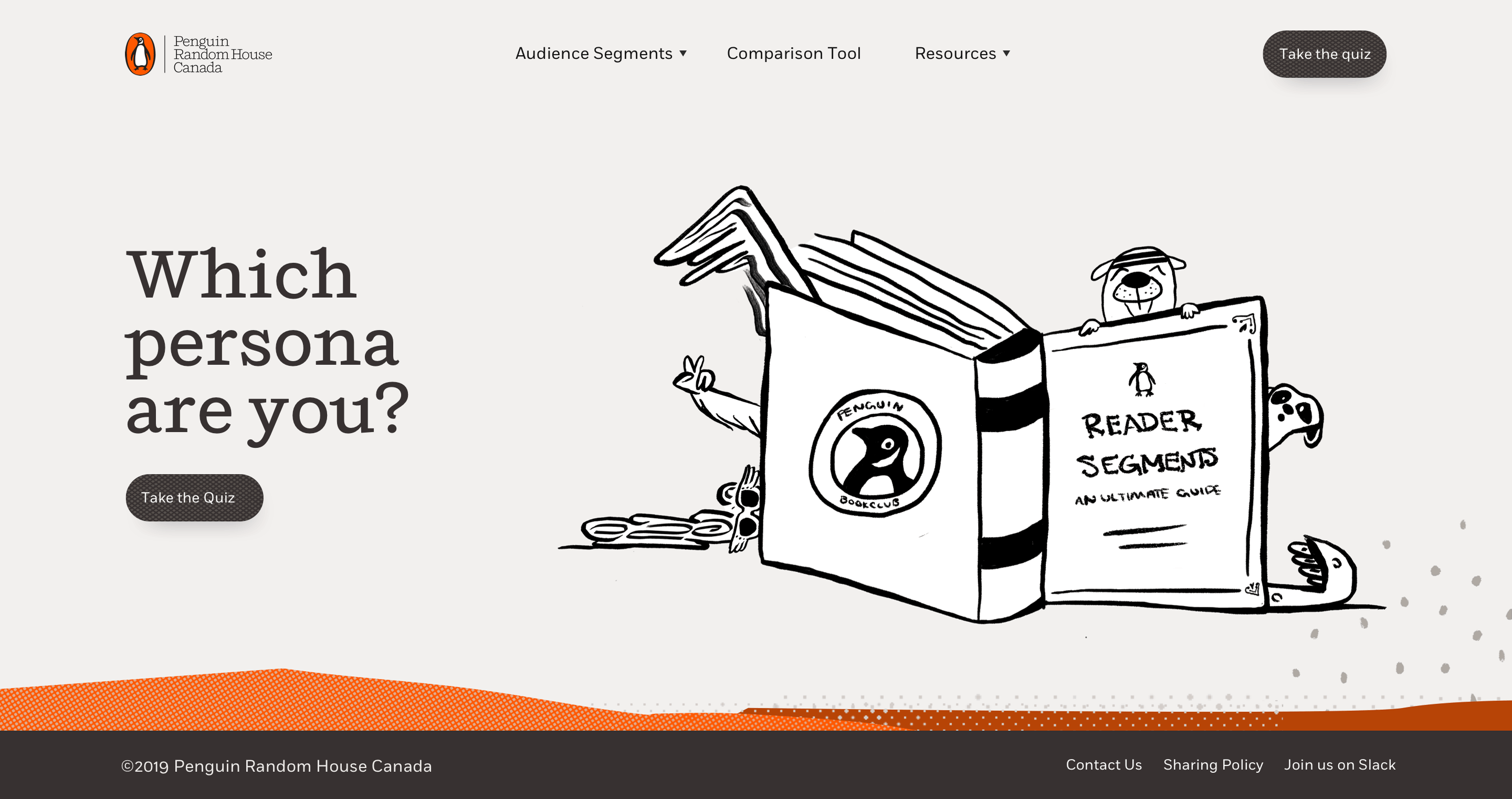
The purpose of this engagement was to arrange the data in a digestible, easy to navigate research portal meant to help staff make well informed marketing, sales and publishing decisions. To do so, we included a user persona quiz for new clients to take and built a web platform that would give staff access to all the latest trends and research that are most relevant to the person they’re starting to help.
To start the project, our stakeholders handed us an excel spreadsheet with over 1,000,000 lines of data to make sense of. As we dug through the data, we booked interviews with staff from different departments within the company to get an understanding of how they use the data.
We interviewed 2-4 stakeholders from 5 departments across Penguin Randomhouse, later sorting their sentiments into affinity maps to find common themes. Some of the quotes that stood out the most were the following:
“The segmentation page should be easily searchable should be ‘snippable’ for sharing.”
“Things were very opaque in the past, so this will help us get closer to our actual customers and provide us with common language to describe our readers.”
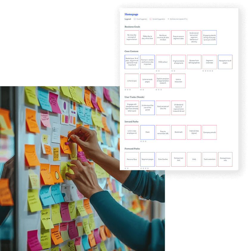
Once complete, we dug into the different categories of data and did a card sorting exercise to help us determine how to group the different statistics in their never-ending spreadsheet.
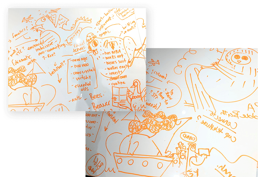
Shortly after, we started doodling ideas for how we might visualize our data.
Style Exploration
Given the offline, traditional print nature of Penguin Randomhouse, we felt it was important to create a visual style that felt modern, yet traditional. We ultimately landed on a print-inspired, hand drawn art direction for its ability to juxtapose whimsical brush illustrations with sophisticated textures. We felt this would bring research to life while allowing it to feel reputable.
We created 3 distinct moodboards, each inspired by the print nature of publishing - but in very different ways.
The final direction chosen was a combination of moodboards #1 and 2.
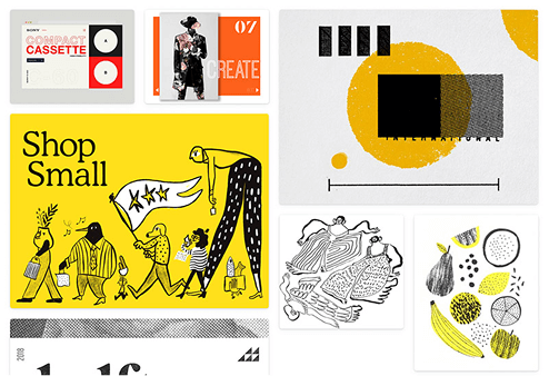
The first moodboard was vibrant and illustrated: incorporating bold, contrasting colours and duo tone patterns with brushy textures.
The second mood board was sophisticated & literary: drawing on the off-white of book pages, inky stains and character illustrations.
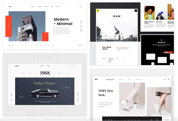
Our final moodboard was modern and minimal. This one was our admitted least favourite, but it would allow us to focus on presenting data with minimal distractions.
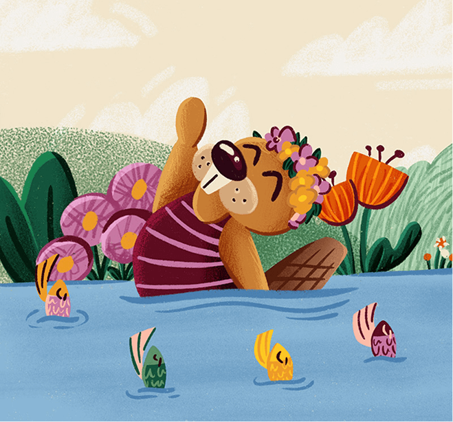
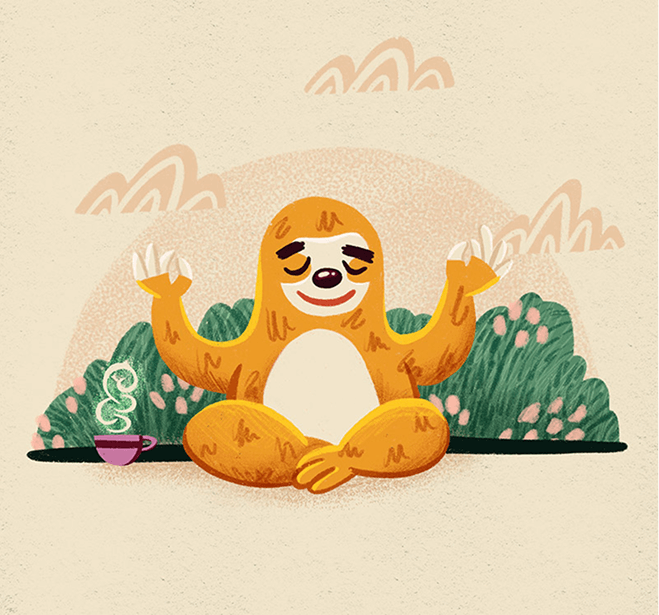
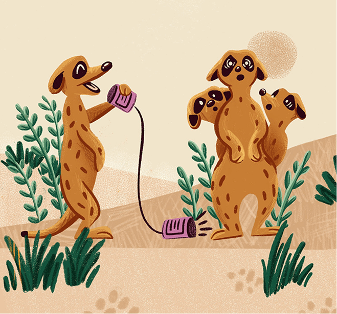
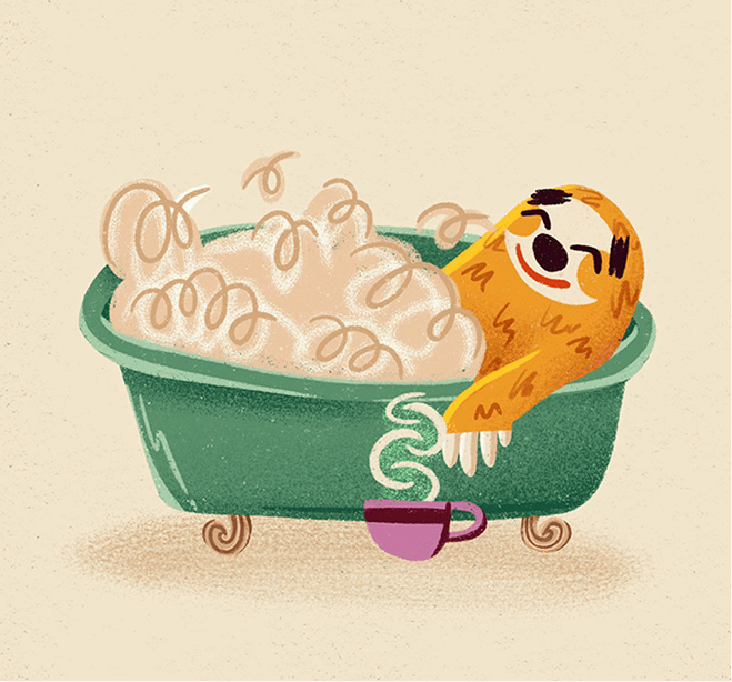
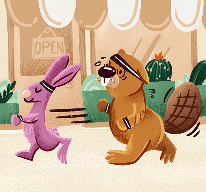
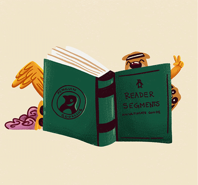
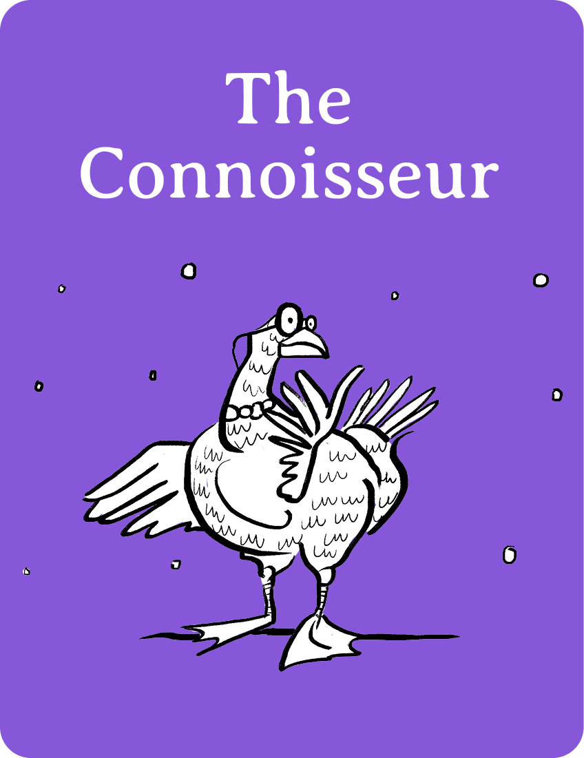
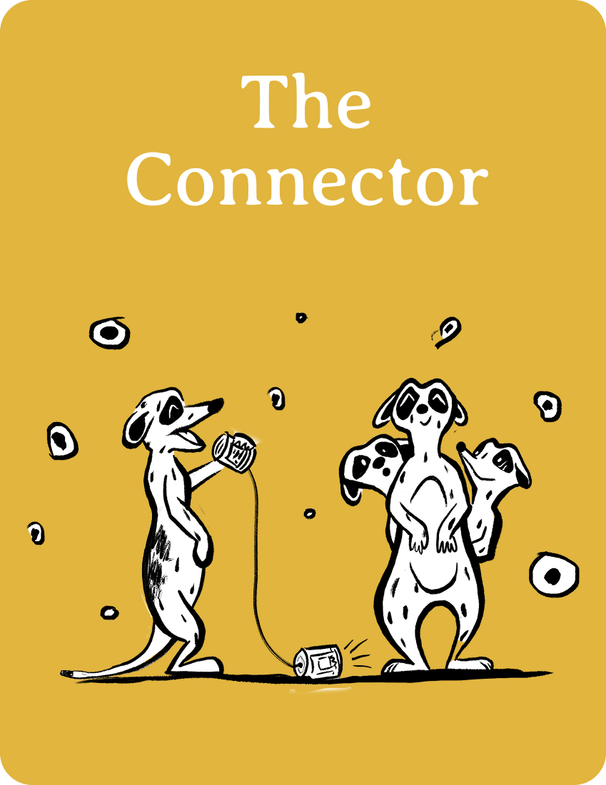
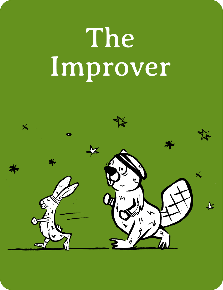
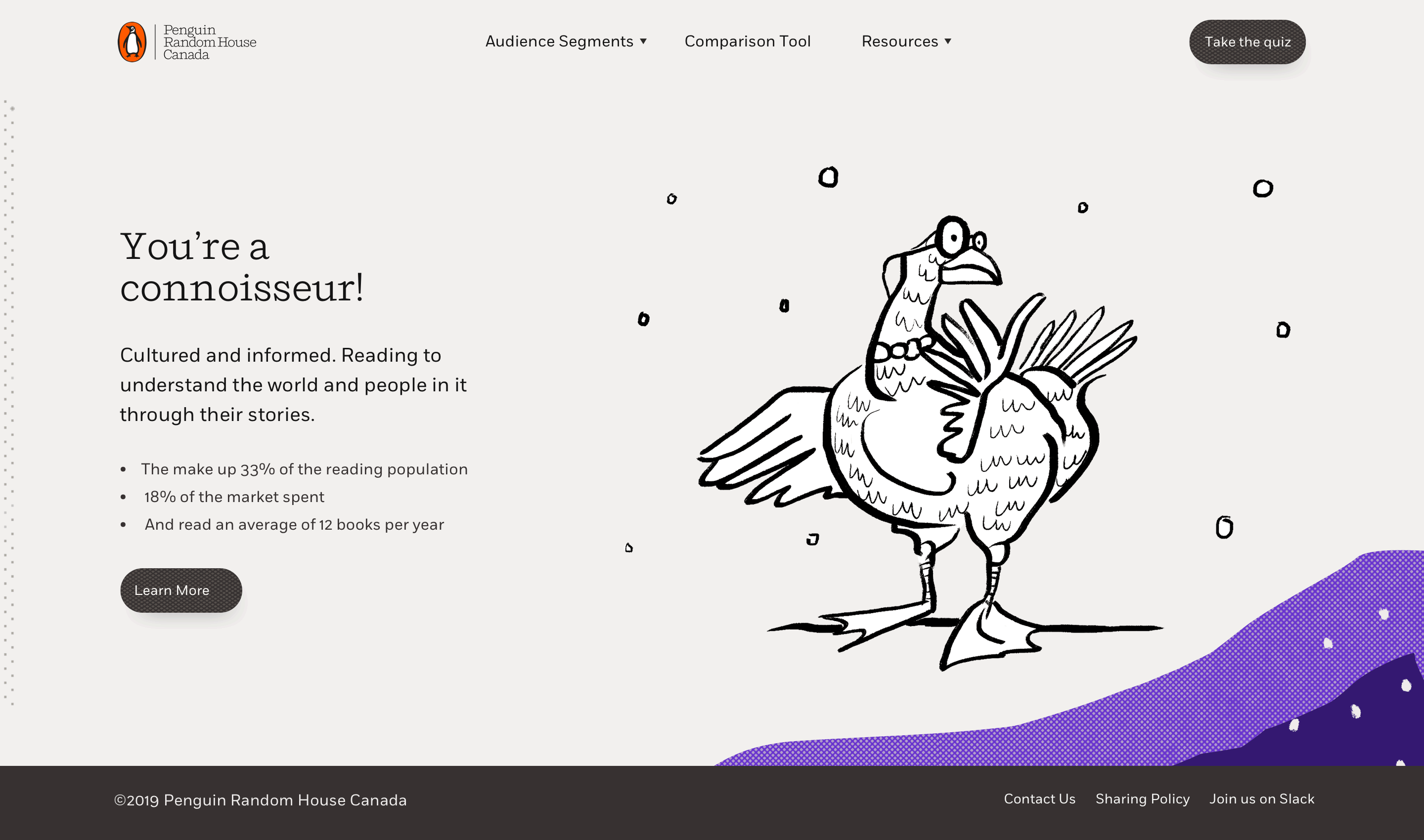
We created characters to give the data the feel of a picture book
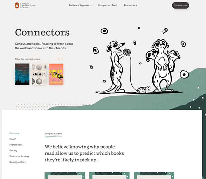
We had 6 different types of readers to represent, who we chose to depict through a series of anthropomorphic animals (who doesn’t love animals?!). We chose an animal for each group that aligned with each reader’s personality traits. Our hope was that the whimsical nature of these illustrations would bring the research to life and help staff build visual associations with each reader type.
The end result
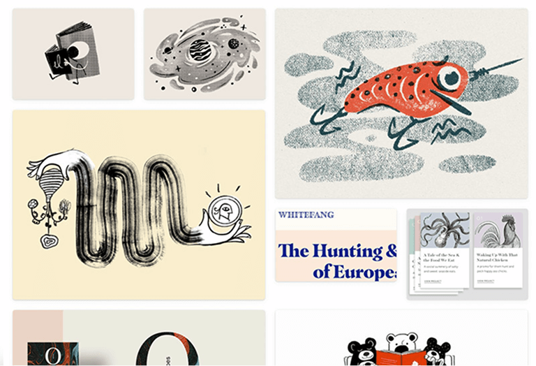
A Sneak Peak at the Expanded Illustrations
As an extension of the initial project, we worked on our series of illustrations that would allow the characters to be used in a story-book way. The below images are the outputs of that project.